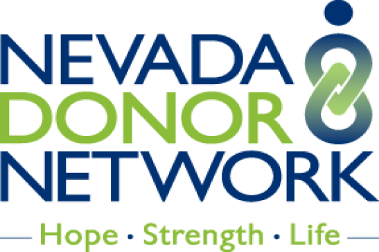
Significance of Our Logo
Nevada Donor Network went through a significant transformation in recent years, with a focus on a renewed commitment to our community and our partners. In order to symbolize these improvements on behalf of the community we serve, we felt it was time for a visual change as well. We set out to design a new brand, representative of who we are as an organization and what this work means to each and every member of our team.
The result is a dynamic new logo symbolic of our mission to maximize the gift of life and health through organ and tissue donation. There are many elements to the logo that hold special meaning. The two interlocking symbols convey the connection between donors and recipients. You may also see the shape of a person, one body made up of two interlocking units, making a whole out of separate components. The shape also represents infinity, symbolic of the continuation of life and health brought by donation and transplantation. The text closely hugs the symbol, implying a close connection between donors and recipients. Finally, the word DONOR is a different color and a bolder type, meant to stand out and serve as a tribute to the gifts each heroic donor has bestowed and the legacy they have left behind to save and improve lives.